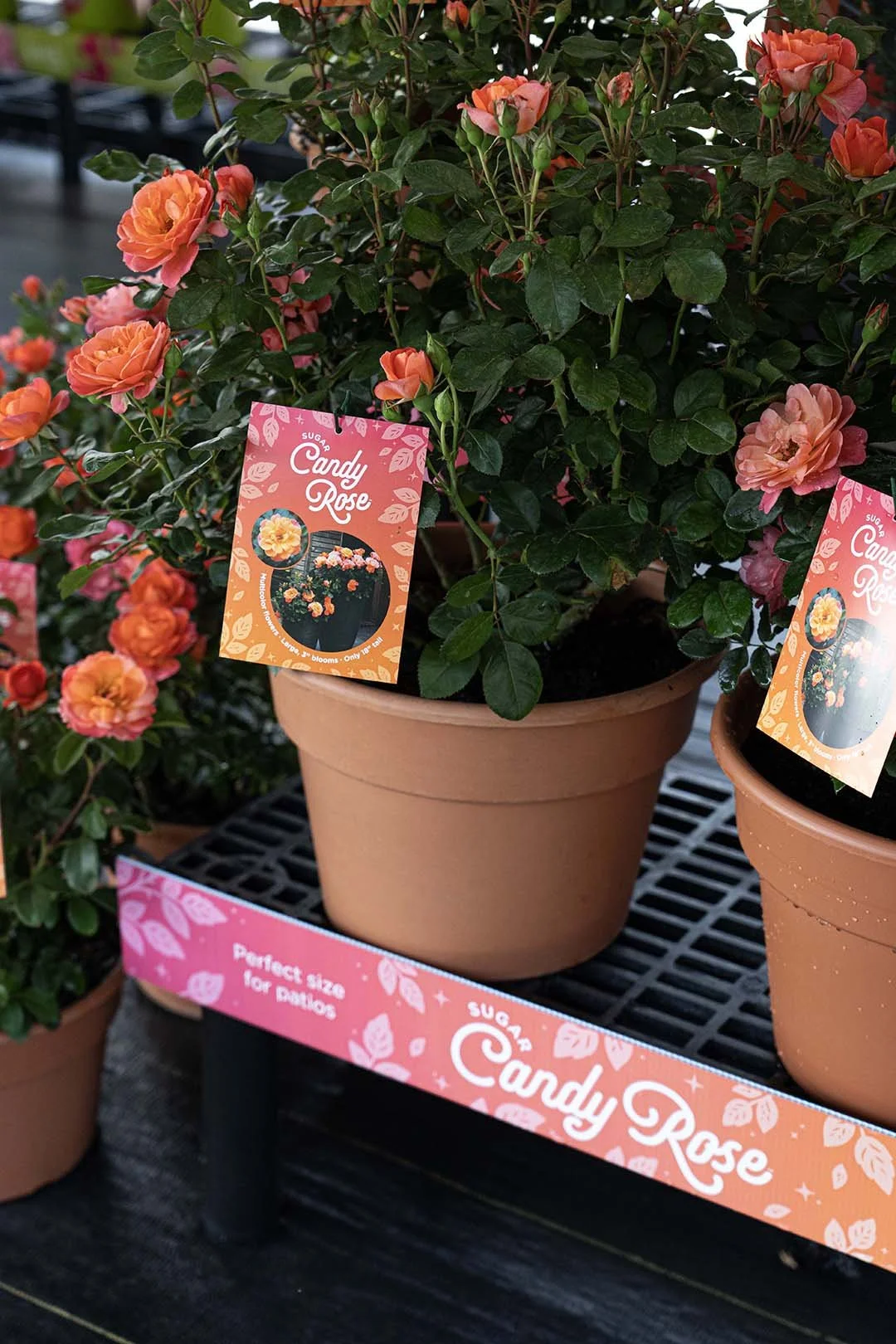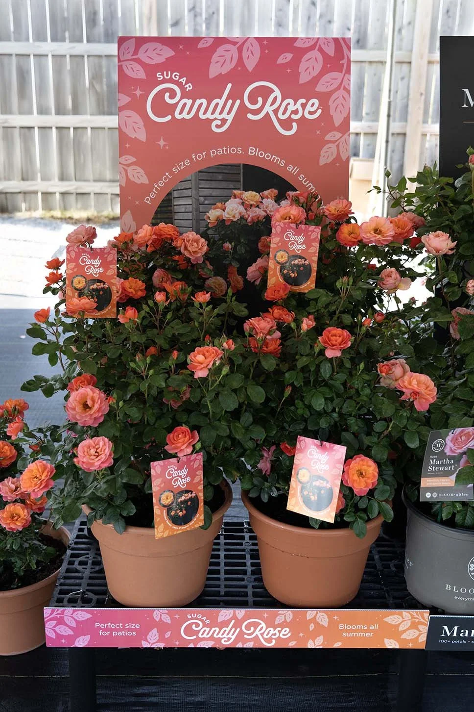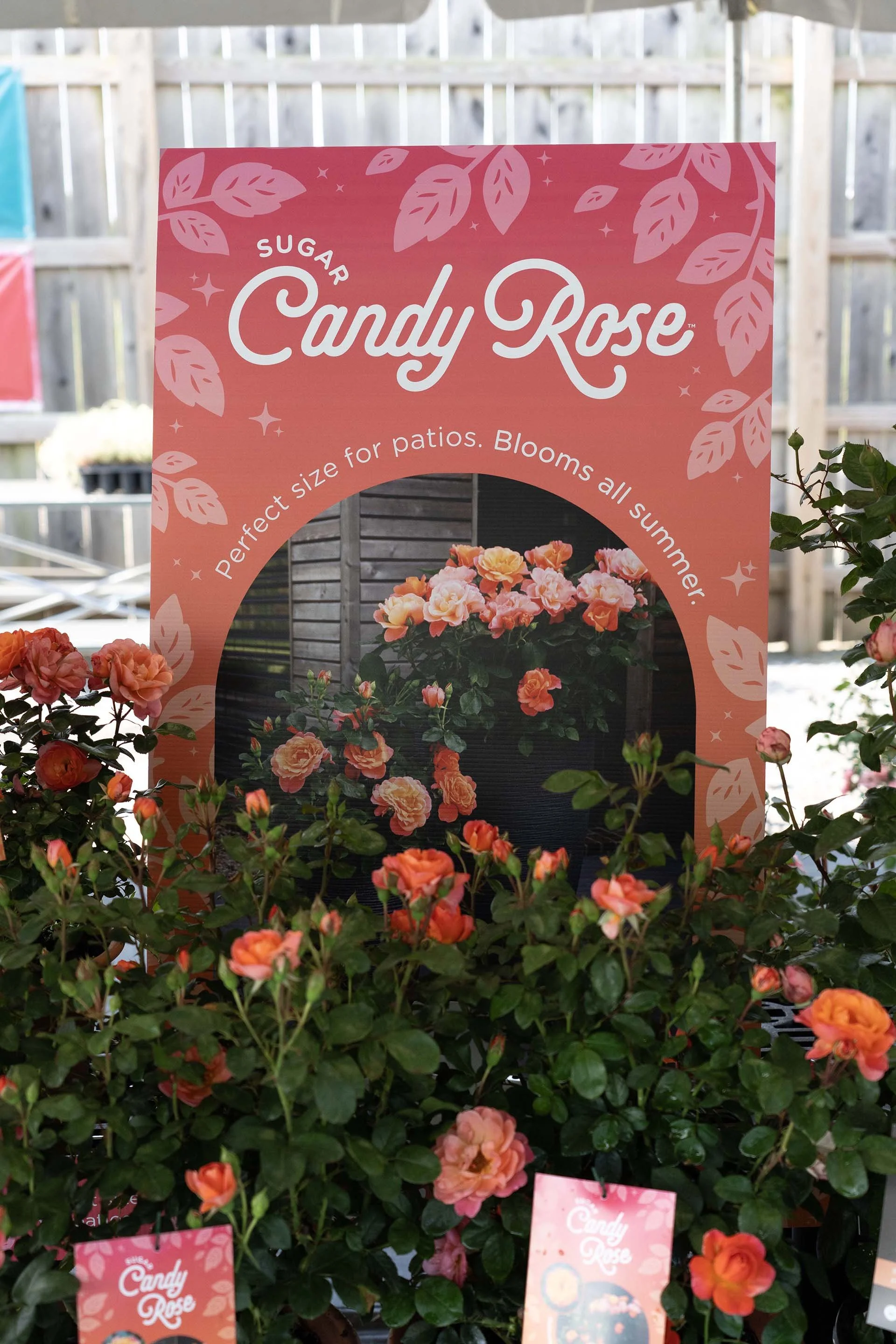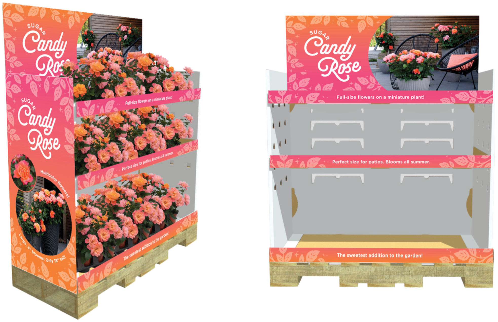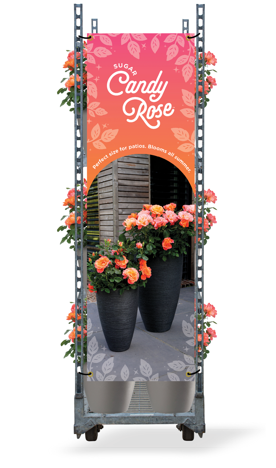
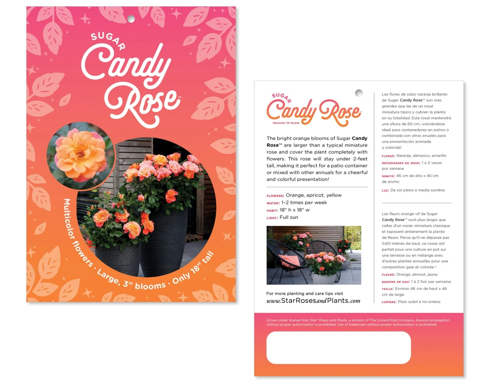
Sugar Candy Rose
Branding | Point of Purchase | Photography
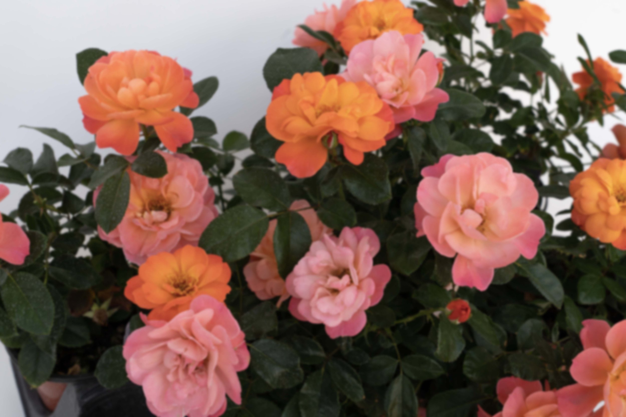
Originally introduced in Europe, Sugar Candy Rose required a fresh identity for the U.S. market. Known for its lush, oversized blooms in vibrant shades of pink and orange. It needed a look that would be eye-catching to the retail consumer. While the original European branding leaned heavily into a playful candy theme, this rebrand takes a more refined approach. Highlighting the bloom colors while subtly nodding to the whimsical, sugary charm of the name.
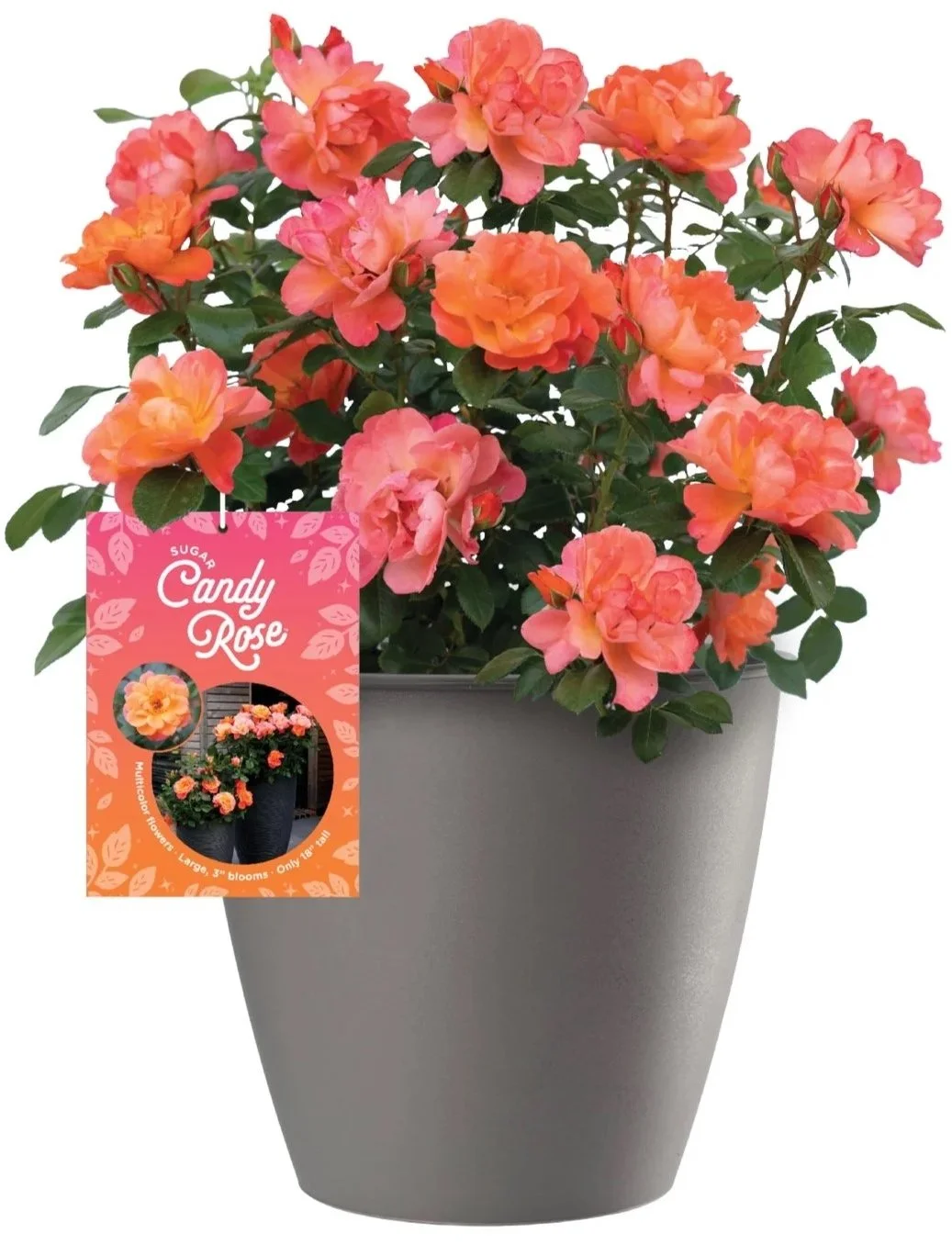
Packaging and
Point of Purchase Materials